Form layout
So I've started drawing the design and thought I would put up a image of the basic layouts I'm thinking about.
The program will convert one format of text to another, based on lists of values. Full details can be found here: https://bitbucket.org/kihonkai/listconverter/wiki/Home
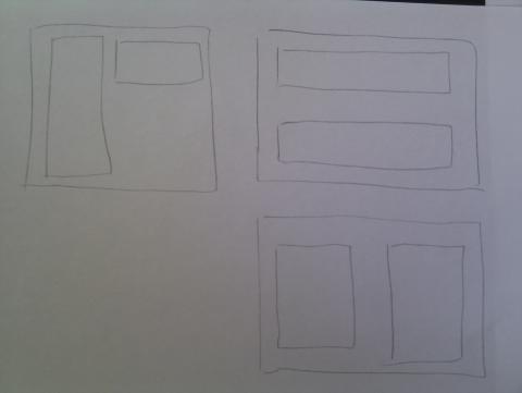
I'm not sure how to lay out the form. the attached image includes three designs I had thought about. the first one I had (top left) fit into my use of the app well but I think it will waste a lot of space. Normally I convert a list of values split by new lines into something else. So I thought about a vertical textbox and a horizontal one, maybe even have the horizontal one below the vertical one. but that would make the form larger and waste a lot of space.
The other option is to split the two text boxes half and half on the form. I then get to choose if I should do it horizontally or vertically. I'm currently swaying towards horizontal since half of the text used will commonly fit like that.
While it didn't take that long for me to think through these idea's in my head it takes quite a bit of text to explain them even for such a small point. But I am doing this as a learning exercise so I'm trying to record what I think about while doing it. In this case it's the layout of the form, but if I make both text boxes use horizontal and vertical scroll bars for excess content it makes it far easier to view a large vertical list of values even in the horizontally layout. At least that is what I have in mind so far.